You Spent €100,000 on an LED Screen. Don’t Let the Graphics Ruin It.
A giant LED screen can make a conference look spectacular.
It can also make it look cheap.
I’ve seen both happen.
Over the years, I’ve worked on conferences, television productions, festivals and large-scale live events across Europe. One thing became clear surprisingly quickly.
The bigger the screen, the more visible the mistakes.
Many people assume a large LED screen automatically creates impact.
It doesn’t.
A large screen only gives your content more space to succeed.
Or more space to fail.
The Screen Shouldn’t Be the Star
This might sound strange coming from someone who creates content for LED screens.
But the screen is rarely the most important element of a conference.
The speaker is.
The message is.
The audience is.
A great conference screen should support the experience, not compete with it.
Think about the music playing in a hotel lobby.
You notice it.
You appreciate it.
It creates atmosphere.
But it never interrupts your conversation.
Conference visuals should work the same way.
The Best Conference Visuals Don’t Demand Attention
Many people try to make conference graphics exciting.
Fast animations.
Bright flashes.
Constant movement.
Complex layouts.
The problem?
Human eyes are programmed to notice movement.
The more movement you introduce, the harder it becomes to focus on the speaker.
Large LED screens amplify this effect.
An animation that feels subtle on a laptop can feel surprisingly aggressive when stretched across a 15-meter-wide stage.
The goal is not to keep people looking at the screen.
The goal is to help them listen.
Why Motion Should Feel Like Nature
Think about standing in front of a mountain lake.
The water moves.
The clouds move.
The sunlight changes.
Yet nothing fights for your attention.
Everything guides it.
The best conference visuals work the same way.
Soft movement.
Gentle transitions.
Natural pacing.
The audience feels comfortable without knowing exactly why.
Rounded shapes often work better than sharp ones.
Subtle motion often works better than dramatic motion.
The screen becomes part of the environment rather than a giant digital billboard.
A Layout I Created in 2019 Is Still Being Used Today
One of the most valuable lessons I learned came from a project I would probably redesign today.
In 2019, I created the stage visuals for the Young Talents Gala in Wrocław.
The event took place inside the Wrocław Opera House.
I didn’t want the screen to fight against the architecture.
I wanted it to feel like it belonged there.
I used elements inspired by a theatre curtain.
A simple 3D character moved slowly across the composition.
Two metallic structures guided the eye toward the logo.
Everything was calm.
Balanced.
Purposeful.
Looking back, I can see many things I would improve.
The animation.
The rendering.
The technical execution.
But something interesting happened.
The organizers kept using the layout.
Year after year.
The date changed.
The event evolved.
The design stayed.
In fact, I still have photos from 2026 showing the same visual concept in use.
That experience taught me something important.
Timeless design often outlasts impressive design.
Design for Cameras, Not Just the Audience
Conference screens have two audiences.
The people in the room.
And the people watching through cameras.
Most people only think about the first group.
Professionals think about both.
A layout that looks great from row five may look completely different through a camera lens.
Logos become too small.
Text becomes unreadable.
Compositions lose balance.
Every important element should be visible both from the back row and from a broadcast camera.
The audience in the room sees the screen.
The rest of the world sees the camera.
The Camera Feed Mistake I See Again and Again
There is another issue that appears surprisingly often.
Camera feeds placed directly behind the speaker.
At first glance, it seems logical.
Show the presenter.
Place the presenter behind the presenter.
Problem solved.
Except it isn’t.
Every video system introduces delay.
Sometimes it’s almost invisible.
Sometimes it’s more noticeable.
But it is always there.
The moment the audience can compare the real person and the screen version side by side, they start noticing the difference.
A blink.
A hand movement.
A smile.
Something feels wrong.
Even if they cannot explain why.
That’s why conference camera feeds often work better when positioned further away from the person speaking.
The screen helps people sitting far away.
It doesn’t compete with reality.
The Museum Lesson That Changed How I Design for LED Screens
Several years ago, I helped install an exhibition for a well-known artist in Berlin.
The artwork was beautiful.
Elegant.
Minimalistic.
Built almost entirely from shades of grey.
On the designer’s monitor, it looked perfect.
On the LED screen, something unexpected happened.
Dark vertical bands began appearing inside the gradients.
The artwork wasn’t broken.
The screen wasn’t broken.
But the result felt wrong.
This phenomenon is one of the reasons why LED content requires its own design approach.
What looks beautiful on a monitor doesn’t always look beautiful on a large LED wall.
And that lesson stayed with me.
LED Screens Love Contrast
One of the biggest strengths of LED technology is contrast.
Bright elements.
Deep blacks.
Clear visual hierarchy.
This is where LED screens shine.
Literally.
Unlike projection, LED screens allow black areas to disappear completely.
You can make parts of the screen vanish.
You can shape the stage using darkness.
You can create focus by deciding what not to show.
Sometimes the most powerful part of a giant LED screen is the part you don’t use.
What Looks Elegant on a Monitor May Fail on LED
This is one of the easiest mistakes to make.
A design gets approved on a laptop.
Everyone loves it.
Then it appears on a giant screen.
And suddenly something feels different.
Fine details disappear.
Gradients behave differently.
Small logos become invisible.
Animations become distracting.
The design wasn’t bad.
It was simply designed for the wrong medium.
That’s why experience matters.
Not because experienced designers know more software.
But because they have seen what happens when great-looking concepts meet real-world screens.
The Goal Is Not to Fill the Screen
Many conference organizers spend months selecting the venue.
Choosing speakers.
Designing the stage.
Planning every detail.
Then they treat the screen as a giant digital wallpaper.
That is a missed opportunity.
A conference screen should shape the atmosphere before the first speaker appears.
It should make people feel comfortable.
Focused.
Interested.
Ready to listen.
The best conference visuals do not scream for attention.
They create the conditions that allow attention to happen.
And that is often far more difficult.
You Spent €100,000 on an LED Screen. Don’t Let the Graphics Ruin It.
A giant LED screen can make a conference look spectacular.
It can also make it look cheap.
I’ve seen both happen.
Over the years, I’ve worked on conferences, television productions, festivals and large-scale live events across Europe. One thing became clear surprisingly quickly.
The bigger the screen, the more visible the mistakes.
Many people assume a large LED screen automatically creates impact.
It doesn’t.
A large screen only gives your content more space to succeed.
Or more space to fail.
The Screen Shouldn’t Be the Star
This might sound strange coming from someone who creates content for LED screens.
But the screen is rarely the most important element of a conference.
The speaker is.
The message is.
The audience is.
A great conference screen should support the experience, not compete with it.
Think about the music playing in a hotel lobby.
You notice it.
You appreciate it.
It creates atmosphere.
But it never interrupts your conversation.
Conference visuals should work the same way.
The Best Conference Visuals Don’t Demand Attention
Many people try to make conference graphics exciting.
Fast animations.
Bright flashes.
Constant movement.
Complex layouts.
The problem?
Human eyes are programmed to notice movement.
The more movement you introduce, the harder it becomes to focus on the speaker.
Large LED screens amplify this effect.
An animation that feels subtle on a laptop can feel surprisingly aggressive when stretched across a 15-meter-wide stage.
The goal is not to keep people looking at the screen.
The goal is to help them listen.
Why Motion Should Feel Like Nature
Think about standing in front of a mountain lake.
The water moves.
The clouds move.
The sunlight changes.
Yet nothing fights for your attention.
Everything guides it.
The best conference visuals work the same way.
Soft movement.
Gentle transitions.
Natural pacing.
The audience feels comfortable without knowing exactly why.
Rounded shapes often work better than sharp ones.
Subtle motion often works better than dramatic motion.
The screen becomes part of the environment rather than a giant digital billboard.
A Layout I Created in 2019 Is Still Being Used Today
One of the most valuable lessons I learned came from a project I would probably redesign today.
In 2019, I created the stage visuals for the Young Talents Gala in Wrocław.
The event took place inside the Wrocław Opera House.
I didn’t want the screen to fight against the architecture.
I wanted it to feel like it belonged there.
I used elements inspired by a theatre curtain.
A simple 3D character moved slowly across the composition.
Two metallic structures guided the eye toward the logo.
Everything was calm.
Balanced.
Purposeful.
Looking back, I can see many things I would improve.
The animation.
The rendering.
The technical execution.
But something interesting happened.
The organizers kept using the layout.
Year after year.
The date changed.
The event evolved.
The design stayed.
In fact, I still have photos from 2026 showing the same visual concept in use.
That experience taught me something important.
Timeless design often outlasts impressive design.
Design for Cameras, Not Just the Audience
Conference screens have two audiences.
The people in the room.
And the people watching through cameras.
Most people only think about the first group.
Professionals think about both.
A layout that looks great from row five may look completely different through a camera lens.
Logos become too small.
Text becomes unreadable.
Compositions lose balance.
Every important element should be visible both from the back row and from a broadcast camera.
The audience in the room sees the screen.
The rest of the world sees the camera.
The Camera Feed Mistake I See Again and Again
There is another issue that appears surprisingly often.
Camera feeds placed directly behind the speaker.
At first glance, it seems logical.
Show the presenter.
Place the presenter behind the presenter.
Problem solved.
Except it isn’t.
Every video system introduces delay.
Sometimes it’s almost invisible.
Sometimes it’s more noticeable.
But it is always there.
The moment the audience can compare the real person and the screen version side by side, they start noticing the difference.
A blink.
A hand movement.
A smile.
Something feels wrong.
Even if they cannot explain why.
That’s why conference camera feeds often work better when positioned further away from the person speaking.
The screen helps people sitting far away.
It doesn’t compete with reality.
The Museum Lesson That Changed How I Design for LED Screens
Several years ago, I helped install an exhibition for a well-known artist in Berlin.
The artwork was beautiful.
Elegant.
Minimalistic.
Built almost entirely from shades of grey.
On the designer’s monitor, it looked perfect.
On the LED screen, something unexpected happened.
Dark vertical bands began appearing inside the gradients.
The artwork wasn’t broken.
The screen wasn’t broken.
But the result felt wrong.
This phenomenon is one of the reasons why LED content requires its own design approach.
What looks beautiful on a monitor doesn’t always look beautiful on a large LED wall.
And that lesson stayed with me.
LED Screens Love Contrast
One of the biggest strengths of LED technology is contrast.
Bright elements.
Deep blacks.
Clear visual hierarchy.
This is where LED screens shine.
Literally.
Unlike projection, LED screens allow black areas to disappear completely.
You can make parts of the screen vanish.
You can shape the stage using darkness.
You can create focus by deciding what not to show.
Sometimes the most powerful part of a giant LED screen is the part you don’t use.
What Looks Elegant on a Monitor May Fail on LED
This is one of the easiest mistakes to make.
A design gets approved on a laptop.
Everyone loves it.
Then it appears on a giant screen.
And suddenly something feels different.
Fine details disappear.
Gradients behave differently.
Small logos become invisible.
Animations become distracting.
The design wasn’t bad.
It was simply designed for the wrong medium.
That’s why experience matters.
Not because experienced designers know more software.
But because they have seen what happens when great-looking concepts meet real-world screens.
The Goal Is Not to Fill the Screen
Many conference organizers spend months selecting the venue.
Choosing speakers.
Designing the stage.
Planning every detail.
Then they treat the screen as a giant digital wallpaper.
That is a missed opportunity.
A conference screen should shape the atmosphere before the first speaker appears.
It should make people feel comfortable.
Focused.
Interested.
Ready to listen.
The best conference visuals do not scream for attention.
They create the conditions that allow attention to happen.
And that is often far more difficult.
You Spent €100,000 on an LED Screen. Don’t Let the Graphics Ruin It.
A giant LED screen can make a conference look spectacular.
It can also make it look cheap.
I’ve seen both happen.
Over the years, I’ve worked on conferences, television productions, festivals and large-scale live events across Europe. One thing became clear surprisingly quickly.
The bigger the screen, the more visible the mistakes.
Many people assume a large LED screen automatically creates impact.
It doesn’t.
A large screen only gives your content more space to succeed.
Or more space to fail.
The Screen Shouldn’t Be the Star
This might sound strange coming from someone who creates content for LED screens.
But the screen is rarely the most important element of a conference.
The speaker is.
The message is.
The audience is.
A great conference screen should support the experience, not compete with it.
Think about the music playing in a hotel lobby.
You notice it.
You appreciate it.
It creates atmosphere.
But it never interrupts your conversation.
Conference visuals should work the same way.
The Best Conference Visuals Don’t Demand Attention
Many people try to make conference graphics exciting.
Fast animations.
Bright flashes.
Constant movement.
Complex layouts.
The problem?
Human eyes are programmed to notice movement.
The more movement you introduce, the harder it becomes to focus on the speaker.
Large LED screens amplify this effect.
An animation that feels subtle on a laptop can feel surprisingly aggressive when stretched across a 15-meter-wide stage.
The goal is not to keep people looking at the screen.
The goal is to help them listen.
Why Motion Should Feel Like Nature
Think about standing in front of a mountain lake.
The water moves.
The clouds move.
The sunlight changes.
Yet nothing fights for your attention.
Everything guides it.
The best conference visuals work the same way.
Soft movement.
Gentle transitions.
Natural pacing.
The audience feels comfortable without knowing exactly why.
Rounded shapes often work better than sharp ones.
Subtle motion often works better than dramatic motion.
The screen becomes part of the environment rather than a giant digital billboard.
A Layout I Created in 2019 Is Still Being Used Today
One of the most valuable lessons I learned came from a project I would probably redesign today.
In 2019, I created the stage visuals for the Young Talents Gala in Wrocław.
The event took place inside the Wrocław Opera House.
I didn’t want the screen to fight against the architecture.
I wanted it to feel like it belonged there.
I used elements inspired by a theatre curtain.
A simple 3D character moved slowly across the composition.
Two metallic structures guided the eye toward the logo.
Everything was calm.
Balanced.
Purposeful.
Looking back, I can see many things I would improve.
The animation.
The rendering.
The technical execution.
But something interesting happened.
The organizers kept using the layout.
Year after year.
The date changed.
The event evolved.
The design stayed.
In fact, I still have photos from 2026 showing the same visual concept in use.
That experience taught me something important.
Timeless design often outlasts impressive design.
Design for Cameras, Not Just the Audience
Conference screens have two audiences.
The people in the room.
And the people watching through cameras.
Most people only think about the first group.
Professionals think about both.
A layout that looks great from row five may look completely different through a camera lens.
Logos become too small.
Text becomes unreadable.
Compositions lose balance.
Every important element should be visible both from the back row and from a broadcast camera.
The audience in the room sees the screen.
The rest of the world sees the camera.
The Camera Feed Mistake I See Again and Again
There is another issue that appears surprisingly often.
Camera feeds placed directly behind the speaker.
At first glance, it seems logical.
Show the presenter.
Place the presenter behind the presenter.
Problem solved.
Except it isn’t.
Every video system introduces delay.
Sometimes it’s almost invisible.
Sometimes it’s more noticeable.
But it is always there.
The moment the audience can compare the real person and the screen version side by side, they start noticing the difference.
A blink.
A hand movement.
A smile.
Something feels wrong.
Even if they cannot explain why.
That’s why conference camera feeds often work better when positioned further away from the person speaking.
The screen helps people sitting far away.
It doesn’t compete with reality.
The Museum Lesson That Changed How I Design for LED Screens
Several years ago, I helped install an exhibition for a well-known artist in Berlin.
The artwork was beautiful.
Elegant.
Minimalistic.
Built almost entirely from shades of grey.
On the designer’s monitor, it looked perfect.
On the LED screen, something unexpected happened.
Dark vertical bands began appearing inside the gradients.
The artwork wasn’t broken.
The screen wasn’t broken.
But the result felt wrong.
This phenomenon is one of the reasons why LED content requires its own design approach.
What looks beautiful on a monitor doesn’t always look beautiful on a large LED wall.
And that lesson stayed with me.
LED Screens Love Contrast
One of the biggest strengths of LED technology is contrast.
Bright elements.
Deep blacks.
Clear visual hierarchy.
This is where LED screens shine.
Literally.
Unlike projection, LED screens allow black areas to disappear completely.
You can make parts of the screen vanish.
You can shape the stage using darkness.
You can create focus by deciding what not to show.
Sometimes the most powerful part of a giant LED screen is the part you don’t use.
What Looks Elegant on a Monitor May Fail on LED
This is one of the easiest mistakes to make.
A design gets approved on a laptop.
Everyone loves it.
Then it appears on a giant screen.
And suddenly something feels different.
Fine details disappear.
Gradients behave differently.
Small logos become invisible.
Animations become distracting.
The design wasn’t bad.
It was simply designed for the wrong medium.
That’s why experience matters.
Not because experienced designers know more software.
But because they have seen what happens when great-looking concepts meet real-world screens.
The Goal Is Not to Fill the Screen
Many conference organizers spend months selecting the venue.
Choosing speakers.
Designing the stage.
Planning every detail.
Then they treat the screen as a giant digital wallpaper.
That is a missed opportunity.
A conference screen should shape the atmosphere before the first speaker appears.
It should make people feel comfortable.
Focused.
Interested.
Ready to listen.
The best conference visuals do not scream for attention.
They create the conditions that allow attention to happen.
And that is often far more difficult.
You don’t need to know how to design conference graphics.
But if you’re investing thousands of euros into a conference, it helps to know what good design looks like.
Because a giant screen doesn’t create a great event.
The right content does.
Industry Insights
Thoughts, experiences and practical knowledge from the worlds of LED technology, immersive environments, animation and live productions.
 Event Visuals
You Spent €100,000 on an LED Screen. Don’t Let the Graphics Ruin It.
You Spent €100,000 on an LED Screen. Don’t Let the Graphics Ruin It. A giant LED screen can make a
 Event Visuals
Why Most LED Screen Visuals Fail on Real Screens
Why Most LED Screen Visuals Fail on Real Screens Why Most LED Screen Visuals Fail on Real Screens I have
 Installations
Why Many Interactive Installations Don’t Need a Custom App
Why Many Interactive Installations Don’t Need a Custom App Designing Reliable Multimedia Systems for Museums, Smart Buildings and Immersive Spaces
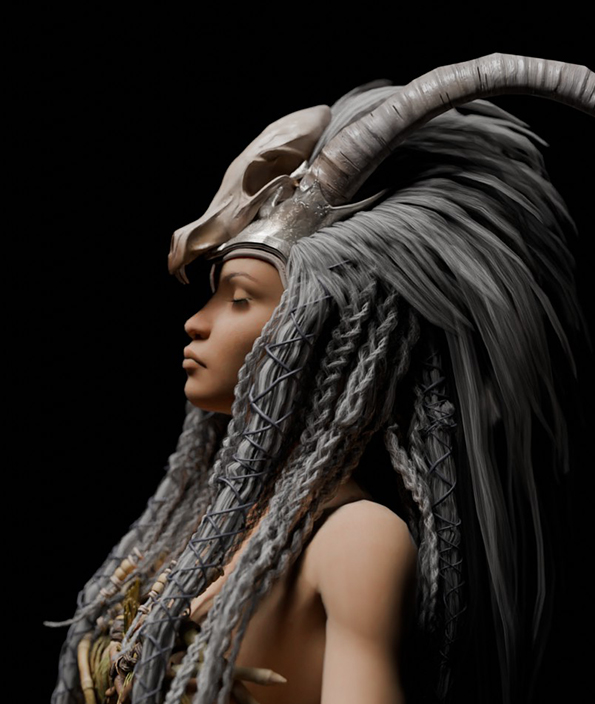 3D Animation
The Moment a Digital Character Starts Feeling Human
The Moment a Digital Character Starts Feeling Human If you’ve spent any time on social media recently, you’ve probably seen
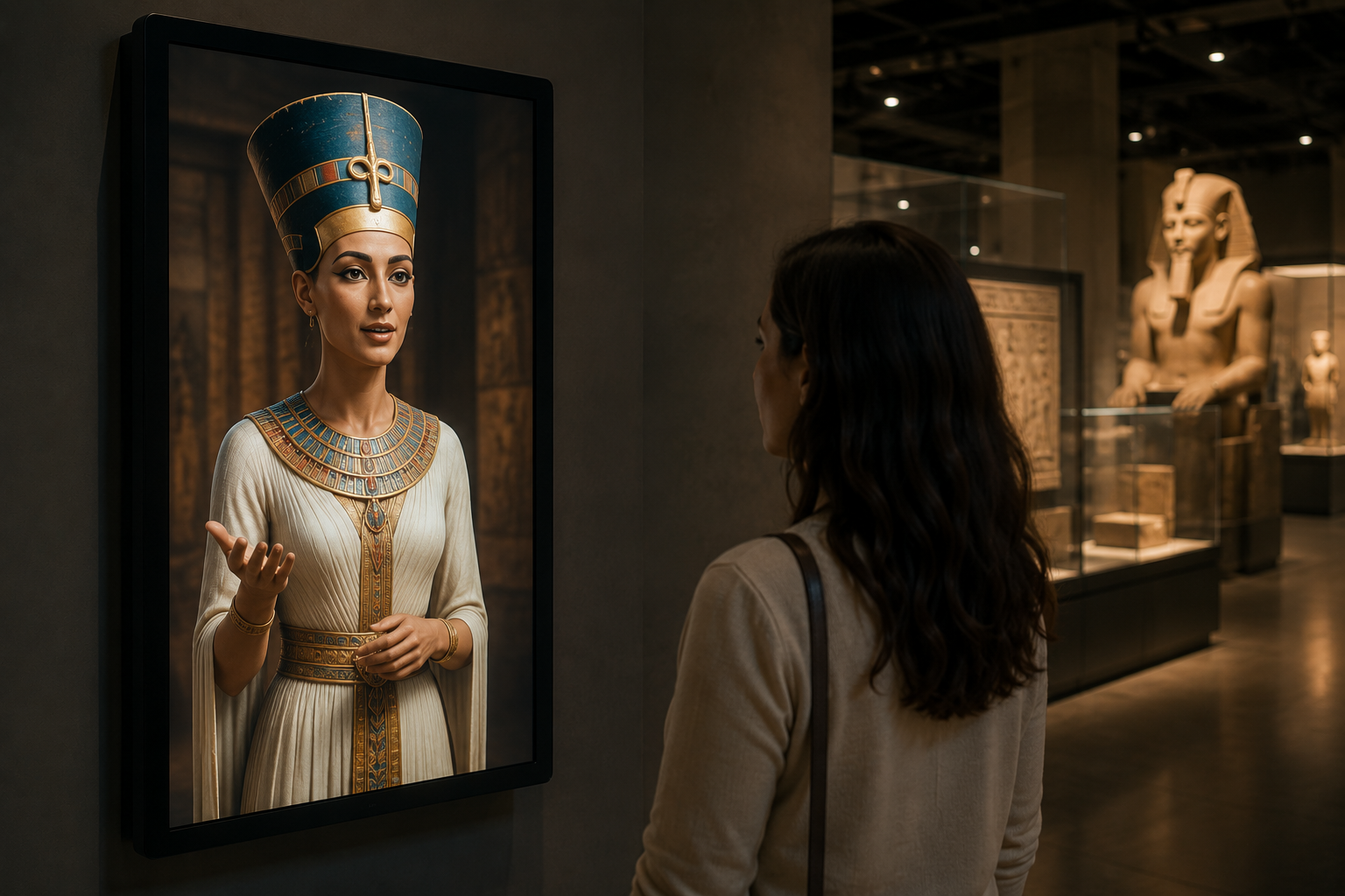 Installations
The Day Your AI Assistant Became a Person
The Day Your AI Assistant Became a Person During my own rehabilitation, I noticed something interesting.The application I was using
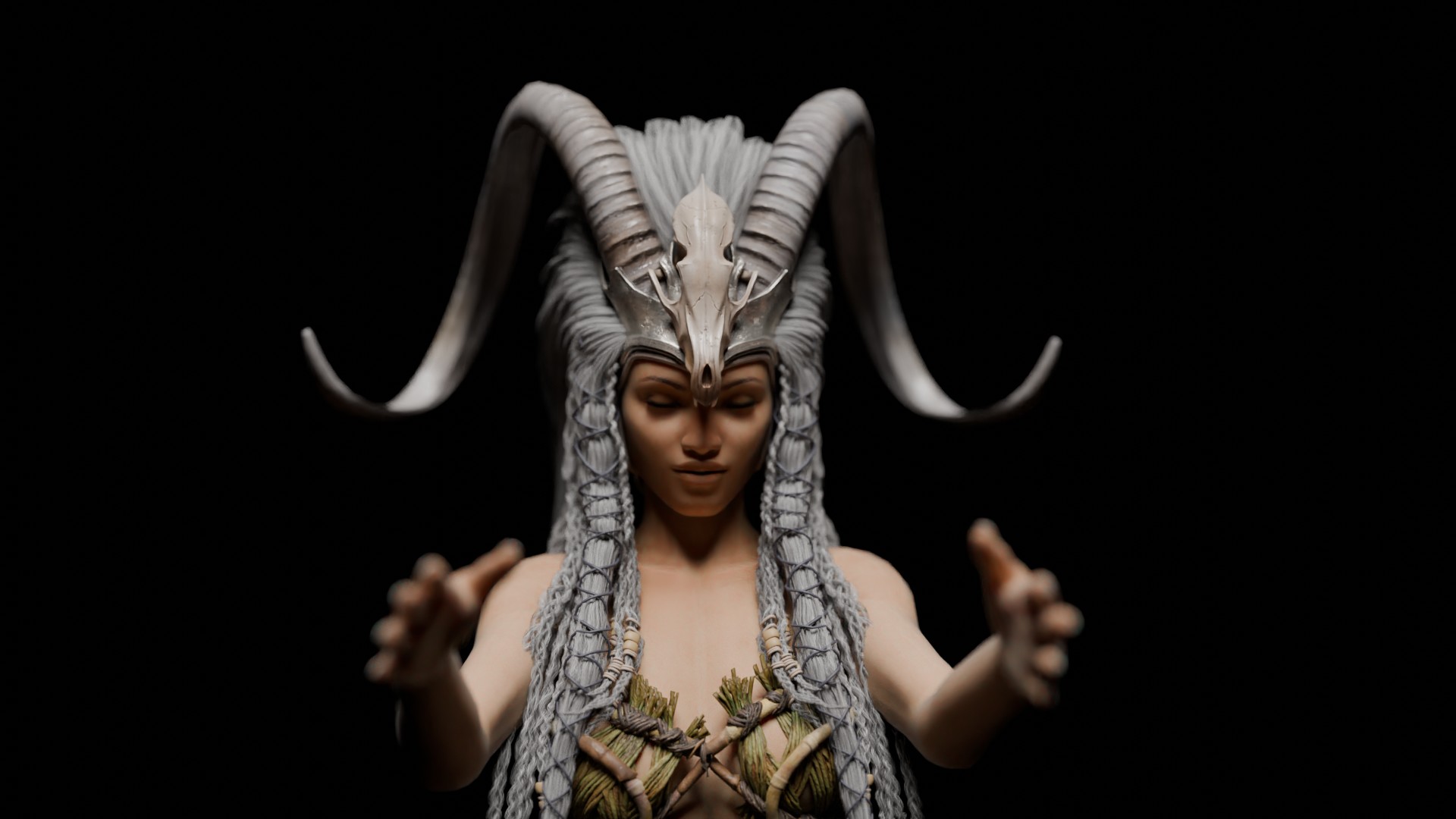 Event Visuals
I Built a Giant Festival Character. Here’s What I Got Wrong.
I Built a Giant Festival Character. Here’s What I Got Wrong. If you’ve spent any time on Instagram in the
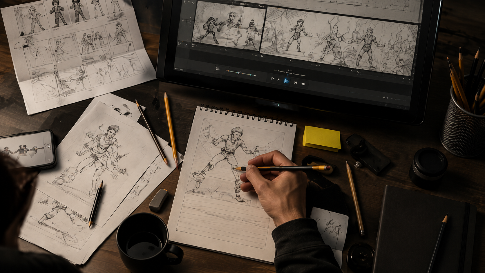 3D Animation
Every Generation of Artists Has Been Afraid of Something
Every Generation of Artists Has Been Afraid of Something Maybe you’ve been browsing our website or reading our recent posts
Industry Insights
Thoughts, experiences and practical knowledge from the worlds of LED technology, immersive environments, animation and live productions.
3D Animation
Every Generation of Artists Has Been Afraid of Something
Every Generation of Artists Has Been Afraid of Something Maybe you’ve been browsing our website or reading our recent posts
Installations
The Day Your AI Assistant Became a Person
The Day Your AI Assistant Became a Person During my own rehabilitation, I noticed something interesting.The application I was using
Installations
Why Many Interactive Installations Don’t Need a Custom App
Why Many Interactive Installations Don’t Need a Custom App Designing Reliable Multimedia Systems for Museums, Smart Buildings and Immersive Spaces
Event Visuals
I Built a Giant Festival Character. Here’s What I Got Wrong.
I Built a Giant Festival Character. Here’s What I Got Wrong. If you’ve spent any time on Instagram in the
Event Visuals
You Spent €100,000 on an LED Screen. Don’t Let the Graphics Ruin It.
You Spent €100,000 on an LED Screen. Don’t Let the Graphics Ruin It. A giant LED screen can make a
Event Visuals
Why Most LED Screen Visuals Fail on Real Screens
Why Most LED Screen Visuals Fail on Real Screens Why Most LED Screen Visuals Fail on Real Screens I have
3D Animation
The Moment a Digital Character Starts Feeling Human
The Moment a Digital Character Starts Feeling Human If you’ve spent any time on social media recently, you’ve probably seen